Rebranding an E-Learning Platform for a Modern Appeal

The Challenge
The existing logo and visual identity of the e-learning platform failed to resonate with contemporary design standards. A fresh and modern approach. Was needed to attract a wider audience and better represent its educational offerings.
The Solution
The project involved creating a new logo, PowerPoint templates, a comprehensive brand manual, and engaging social media banners.
Our approach included:
In-Depth Brand Analysis
We conducted a thorough analysis of the platform’s core values, mission, and target audience. This understanding informed the development of a new visual identity that accurately reflected the brand’s essence.
Logo Design
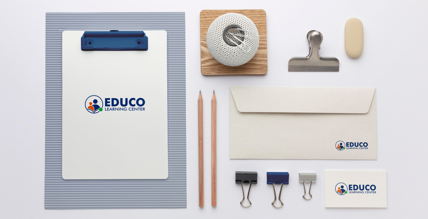
A new logo was created by combining various shapes and elements that symbolized learning, children, parents, and the online educational environment. The logo was designed to be both visually appealing and memorable.
PPT Template Creation
A versatile PowerPoint template was developed using the new logo and brand elements. This template ensured consistency and a professional look for all presentations.
Brand Manual Development
A comprehensive brand manual was created to provide guidelines for using the new logo, colors, fonts, and other visual elements. This ensured a unified brand appearance across all marketing materials.
Social Media Banner Design
Engaging social media banners were designed to capture the attention of the target audience and promote the platform’s educational offerings. The banners incorporated the new logo and brand elements.
The above steps were taken to revitalize the e-learning platform’s visual identity, enhance its appeal to modern audiences, and position itself as a leading educational resource provider.

The Outcome
The rebranding project successfully delivered:
Enhanced Brand Recognition
The new logo and visual elements are more memorable and recognizable, helping the platform stand out in a competitive market.
Increased Engagement
The modern and appealing design has led to increased engagement with the platform’s target audience.
Improved Brand Consistency
The brand manual ensures that all marketing materials adhere to a consistent visual style, strengthening the platform’s brand identity.
Enhanced Professionalism
The updated visual identity conveys a more professional and trustworthy image of the e-learning platform.

