
StudioSync is a comprehensive platform designed to simplify professional photography business management. It offers a range of tools for lead management, scheduling, media sharing, client communication, and staff management. It aims to provide an efficient experience for both photographers and their clients. Our challenge is to effectively communicate the features and benefits of the platform through a minimal but impactful branding strategy.
The key challenges for the StudioSync branding project are:
As a rule of thumb, at Tentackles, we begin all our projects with thorough research. It was imperative to learn about StudioSync’s market, target audience, and objectives before we formulated a branding strategy.
The information gained from research, helped us define the platform’s identity, tone, and visual direction in the strategy phase. Key elements such as the logo, color palette, and typography were developed to reflect the brand’s mission.
In the design phase, the elements were then translated into a cohesive, intuitive website design that aligned with the platform’s personality. Regular feedback ensured that all elements remained consistent with stakeholder goals.
The final step was implementing the new brand identity across the StudioSync interface.
The brand strategy for StudioSync focused on creating a distinct identity that communicates the platform’s value to creative professionals. We emphasized its ability to simplify complex processes while maintaining a user-friendly and modern design.
The messaging framework highlighted efficiency, innovation, and ease of use. Visually, we opted for a clean, modern aesthetic that balanced functionality with elegance. This cohesive strategy helped position StudioSync as a reliable, essential tool in its market.
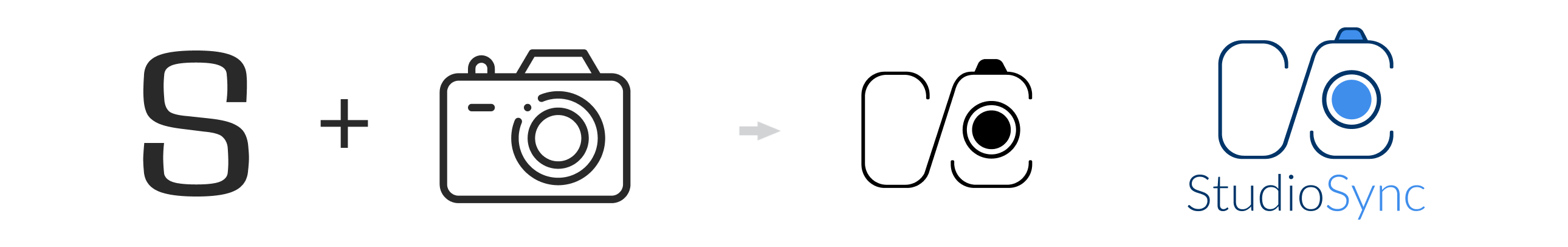
The StudioSync logo was designed to reflect the platform’s focus on efficient, streamlined business management for photographers. It features an “S” with elements of a camera integrated into the design. Here’s a breakdown of the logo:
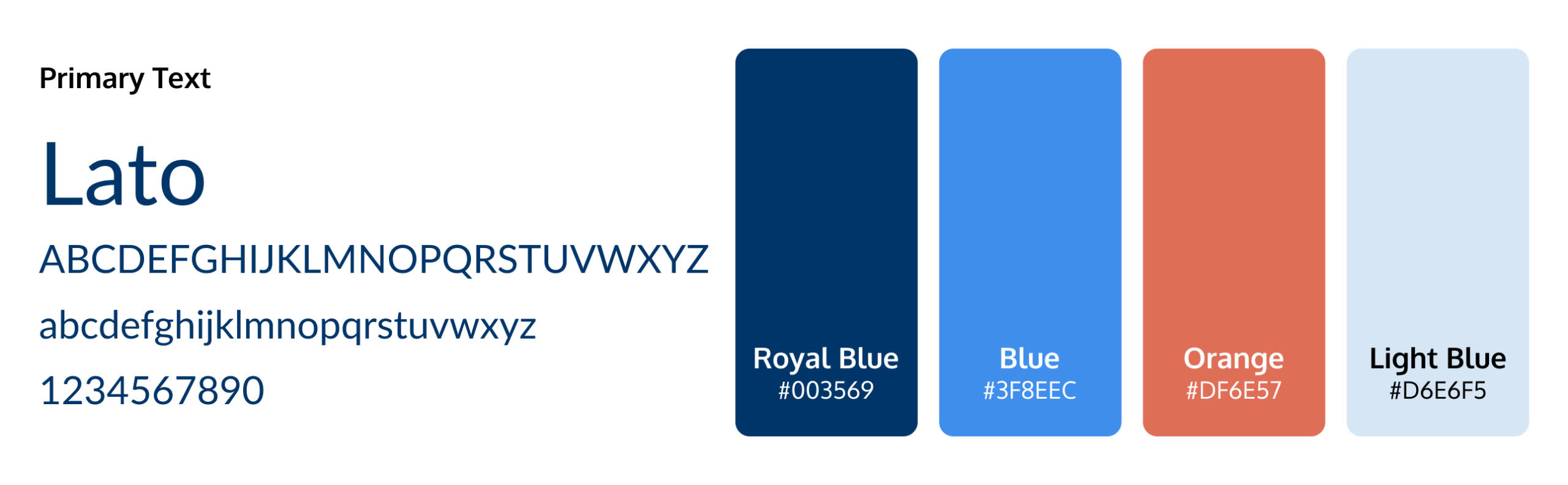
The logo breakdown for StudioSync highlights the careful balance between creativity and functionality. StudioSync logo features the letter “S” kept horizontally with elements of a camera in it. The sans serif font used in the evokes modernity and minimalism element of the brand. The color palette, with different shades of blue, convey reliability and trustworthiness.
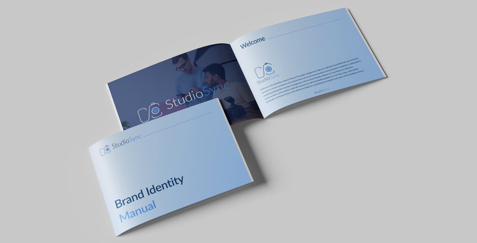
We developed a comprehensive brand manual for StudioSync to retain consistency across all platforms and communications. The manual covers logo usage, color schemes, typography, and tone of voice, providing detailed guidelines for maintaining visual integrity.
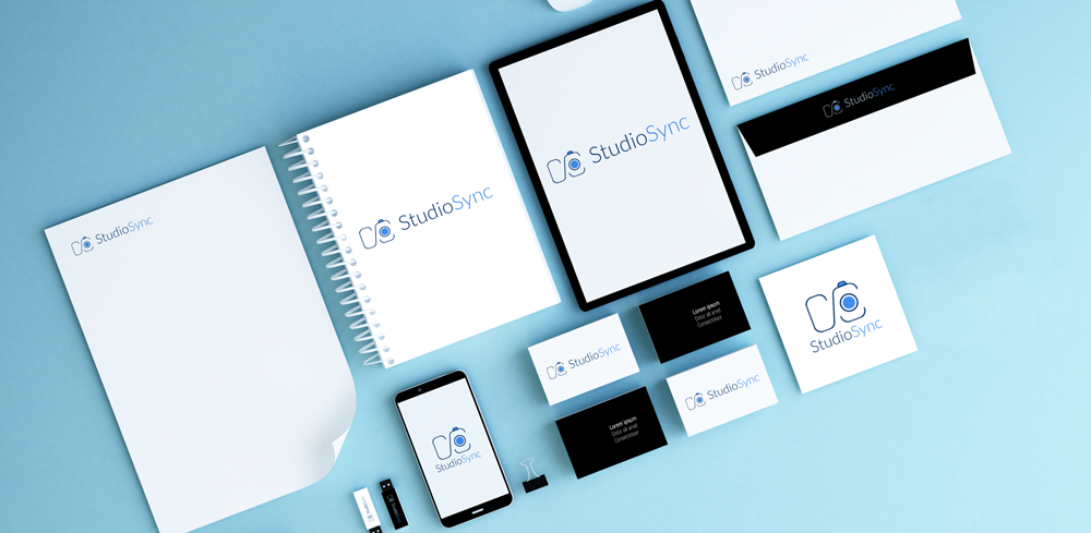
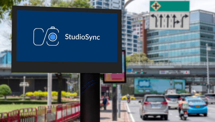
Digital assets like website banners, social media graphics, email templates, and downloadable resources were created with consistent branding elements. Physical collateral, including business cards, brochures, and branded merchandise, extended the brand’s presence beyond the digital realm.
The StudioSync branding project successfully created a cohesive, professional identity that aligned with the platform’s target audience. Through a clear strategy, compelling visuals, and user-friendly design, StudioSync’s branding stood out in a competitive market.