
Online Education Platform
Brand Manual, Logo, Brand Colors, Typography, Branding Collateral
Refining the Identity of an Online Math Education Leader
Educo Learning Center (ELC) offers a simple and engaging platform that leverages technology for global access to online math learning. Designed to be a user-friendly experience for students, parents, and educators, the brand’s identity needed a minimalist yet versatile redesign that resonates with its varied audience.
Tentackles partner with ELC to redefine their brand identity and position it as a leader in the global online education landscape. Our mission was to create a brand that reflects their core values in a clear and memorable way.

The Challenge
One of the biggest challenges in this branding project was developing a clear, compelling brand identity that stood out from competitors. We needed to ensure that ELC’s visual elements, tone, and messaging aligned with their values and remained consistent across all touchpoints. Additionally, stakeholder alignment and adapting to evolving feedback were crucial for success.
Our Approach
Our branding process for ELC started with thorough research. We explored the target audience, competitors, and ELC’s unique value proposition. From there, we developed a brand strategy that captured their mission, vision, and messaging.
Once the strategy was in place, we moved into the creative phase, working on logo design, color palettes, typography, and defining the brand’s voice. Feedback and refinement played key roles in ensuring all branding elements aligned with ELC’s goals.
Brand Strategy
ELC’s brand strategy is rooted in empowering and engaging educators and students through technology. We focused on positioning ELC as a platform that bridges traditional teaching with modern tools. The strategy emphasized inclusivity, academic excellence, and creating a supportive learning environment. This approach was carried out through ELC’s visual identity, messaging, and communication to ensure consistency and reach.
Color Palette
Royal Blue
#1D4487
Orange
#F26922
Green
#33B44A
Coral
#E36858
Light Blue
#1D4487
Mint
#1D9A7C
Teal
#2292A0
Typography

Logo Design
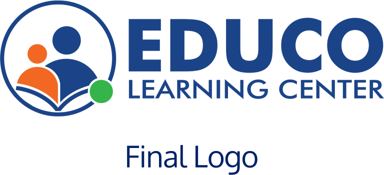
We wanted to create a simple yet meaningful design that represented the platform’s dual focus on parents and children. The logo features two figures—one for the parent and one for the child—connected by an open book, symbolizing shared learning. The use of orange for the child and blue for the parent creates a balance between playfulness and professionalism, while the green circle symbolizes their digital connection.
Logo Breakdown
The logo with minimal elements justifies the brand identity of having both kids and parents on the same digital platform. The platform caters to the learning needs of parents and the child and this logo represents it in a very subtle manner.
The two figures in the logo in different sizes and colors represent the parent and the child. The silhouette with orange color depicts the child, and the blue one depicts the parent. The curve underneath the silhouettes represents an opened book. The book in the logo has been used as an intellectual object.
Since the brand is an e-learning platform and provides the services digitally, the green circle depicts that the child and parent are online when learning with Educo.

Branding Manual
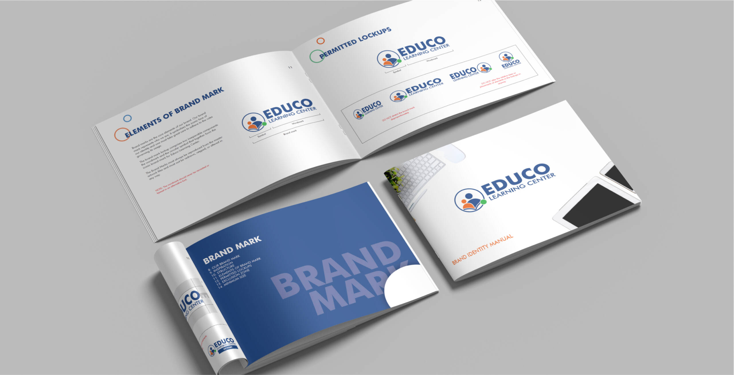
To maintain consistency across all brand touchpoints, we developed a branding manual for ELC. This guide outlines the essential elements of the brand’s identity, making sure that designers, marketers, and partners follow the same guidelines. It serves as a reference for future designs so that every interaction with ELC reflects its core values.

Branding Collateral
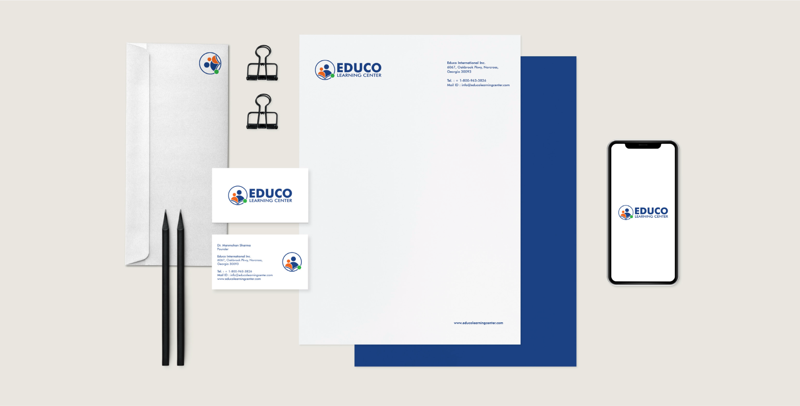
We also created a full suite of branding collateral, including marketing materials, digital assets, and educational tools. These materials reinforced ELC’s mission of bringing educators, parents, and children together through learning. Every piece was designed to build trust and recognition while maintaining a cohesive brand experience.
The Result
Our branding project for ELC successfully established a strong, cohesive identity that resonated with its audience. By aligning ELC’s values, messaging, and visual elements, we created a unified experience that boosted the brand’s presence. This new identity not only reinforced ELC’s mission but also positioned them for future growth and long-term success.

