Online Education
Web Application
Research, Design, and Development
Optimizing Digital Learning Management System for Usability
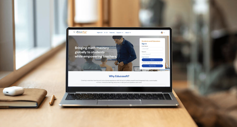
Technology and digital content are at the forefront of Educosoft’s vision. To make high-quality education more accessible and effective, we gave the platform’s interface and user experience a much-needed upgrade focused on usability. A blend of intuitive navigation, interactive tools, and engaging content brought out the digital learning platform’s best features.
About the Client
EducoSoft is a leading provider of learning management systems, instructional tools, and interactive digital content, focused on improving math education through technology. It is powered by Educo International Inc. founded in 1985 by Dr. Man Mohan Sharma, professor emeritus at Clark Atlanta University.

Our Deliverables
Website Redesign
Key Challenges
Diverse Users
EducoSoft needed a user-friendly platform that accommodates the needs of educators, students, and administrators. Each group required easy access to specific tools and resources. So, the platform needed to be intuitive and versatile.
Complex Navigation
The existing platform suffered from a cluttered and confusing navigation structure. Users found it difficult to efficiently find the tools and content they needed. Simplifying the user journey was a top priority of the project.
Inconsistent Design
Inconsistent design elements create a disjointed user experience. The interface needed to be unified with a clean, cohesive look to enhance usability and reflect the brand’s professionalism.
Lack of Mobile Optimization
With more users accessing content on mobile devices, the lack of mobile optimization posed a major issue. The platform needed to be responsive and functional across all screen sizes.

Our Solutions
UI/UX Redesign
We completely overhauled the user interface by simplifying the navigation. This allowed educators, students, and administrators to access the relevant tools and resources without friction.
Responsive Design
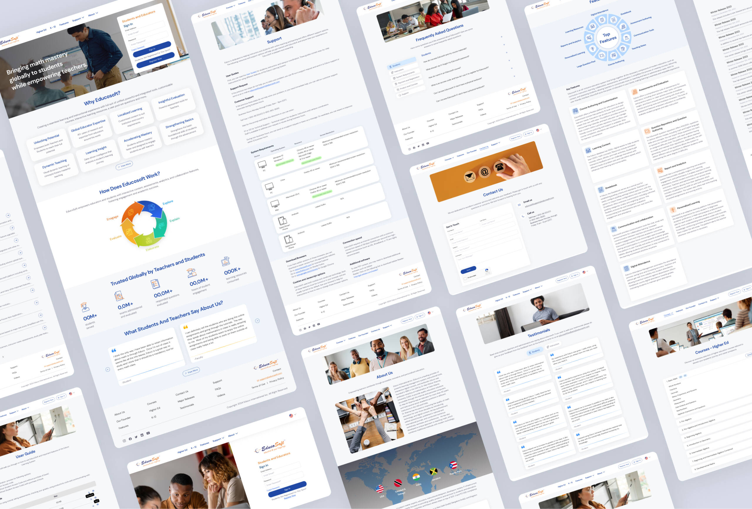
The redesigned platform has a clean, modern look, optimized for both desktop and mobile devices. This made sure the user experience remained consistent on a computer, tablet, or smartphone.
User Engagement
Interactive elements improved user engagement on the platform. The learning experience became more dynamic and appealing to diverse users.
Simplified Structure
We restructured the platform to create a more logical flow of information. It was easier to navigate and access resources, helping streamline the user journey from start to finish.
Usability Testing
We made sure the platform worked flawlessly across all devices, by conducting extensive testing. The new design met the highest standards of responsiveness, usability, and accessibility.
UI Design

Project Summary
EducoSoft collaborated with Tentackles to completely redesign their platform. The goal was to make it more intuitive and accessible for educators, students, and administrators.
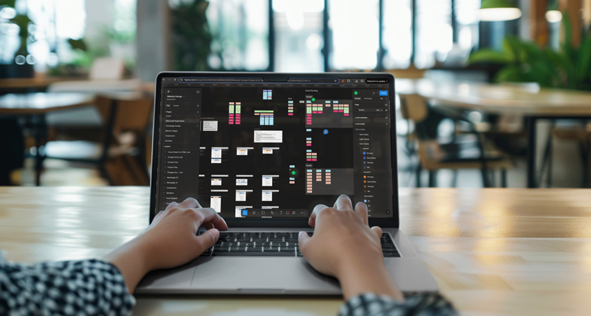
Our process began with a thorough analysis of both competitor platforms and EducoSoft’s existing site. We identified issues in navigation, usability, and content accessibility. Based on these findings, our UI/UX experts developed wireframes and prototypes aimed at simplifying the interface. We also incorporated user feedback to refine functionality throughout the design process.
The final solution included a modern, responsive platform optimized for all devices. Streamlined navigation and interactive elements enhanced user engagement. EducoSoft’s learning management tools and digital content were also integrated smoothly. The result is a cohesive, tech-driven platform that reflects EducoSoft’s commitment to advancing education through innovation.

