Your website should fit the device your visitors are using, just like clothes fit different body types. And that’s why, Adaptive Design and Responsive Design are critical to web development in the ever-evolving digital landscape.
Adaptive and Responsive design has the same goal – create websites that look great and function smoothly on all devices, from smartphones to desktops. However, each methodology has different approaches to reaching this goal. Understanding this difference is important – for web developers and businesses – as it has a big impact on the engagement, accessibility, and overall success of a website.
Adaptive Web Design vs Responsive Web Design
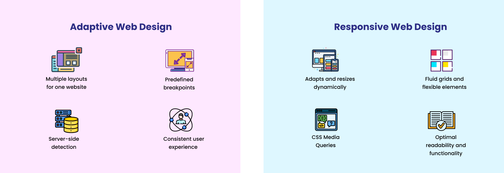
Adaptive Design is like having a wardrobe of outfits: one for a formal event, one for a casual outing, and one for the gym. That is you maintain multiple versions of your website’s layout, each tailored to a specific device size or breakpoints.
Instead of adjusting elements fluidly, adaptive design predefines set layouts optimized for different screen sizes. When a user accesses the website, the server detects the device and serves the most appropriate layout.
Responsive Design is like a chameleon or a stretchy outfit that fits anyone perfectly, no matter the size. No need to maintain multiple versions of the website. This method uses fluid grids and flexible elements that change their appearance based on the screen size of the device.
Unlike adaptive design, responsive layouts fluidly adjust based on the user’s viewport. Responsive websites use CSS media queries to dynamically resize and rearrange content, ensuring optimal readability and functionality across devices.
Adaptive Design Benefits
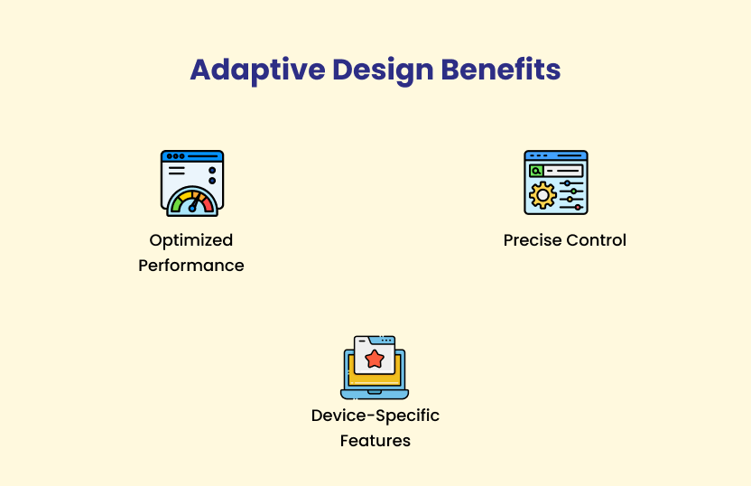
Optimized Performance
Tailored layouts mean faster loading times, especially on slower devices.
Precise Control
You have more control over how your website looks on different devices.
Device-Specific Features
You can include features that are unique to specific devices.
- Customized Content Delivery: Adaptive design delivers specifically optimized layouts based on the user’s device size. This results in faster loading times and improved performance. Devices with limited bandwidth such as mobile phones or tablets greatly benefit from this optimization.
- Reduced Data Usage: By loading only the necessary assets for a particular device, adaptive web design minimizes data usage. This advantage is crucial for users accessing the website on mobile networks with data limitations.
- Consistency and Brand Alignment: Designers have better control over how content is presented on different devices. It ensures consistency in branding and messaging across various touchpoints.
- Customized User Experience: With adaptive design, designers can tailor the user experience to match the capabilities and constraints of different devices. It helps optimize usability and engagement for each user segment.
- Enhanced Interaction: Adaptive design allows for the integration of device-specific features and functionalities, optimizing user interaction and engagement across various platforms.
Responsive Design Benefits
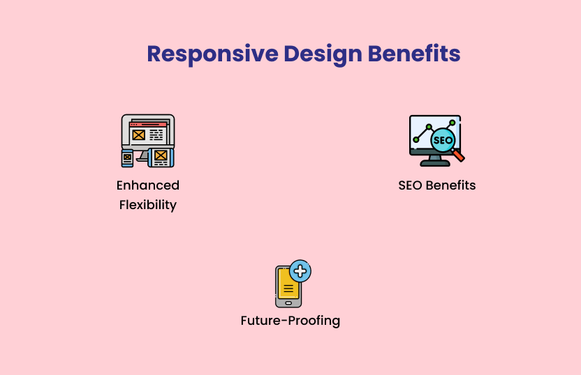
Enhanced Flexibility
One website works on all devices, making it easier to manage.
SEO Benefits
Search engines favor mobile-friendly responsive websites.
Future-Proofing
It’s easier to adapt to new devices as they emerge.
- Seamless Adaption: Fluid grids and flexible elements adapt to any screen size, ensuring flexibility and optimal user experience across a wide range of devices.
- Cross-Device Compatibility: The website layout automatically adjusts to fit the screen dimensions of the device, eliminating the need for separate layouts or redirects based on device detection.
- Mobile-Friendly Ranking: Responsive websites are favored by search engines, particularly Google, which prioritize mobile-friendly content in search rankings.
- Single URL Structure: Responsive design maintains a single URL structure across all devices. This consolidates link equity and simplifies SEO efforts by eliminating the need for separate mobile URLs or canonical tags.
- Scalability and Adaptability: Responsive websites remain relevant and accessible with the entry of new devices and screen sizes.
- Cost and Time Efficiency: By creating a single responsive website that adapts to various devices, businesses can save time and resources on development, maintenance, and updates.
Choosing the Right Approach
The best approach for your website depends on your specific needs. If you have a complex website with lots of unique content for different devices, Adaptive Design might be the way to go. However, if you want a simpler, more flexible solution, Responsive Design is often the preferred choice.
Key Takeaways:
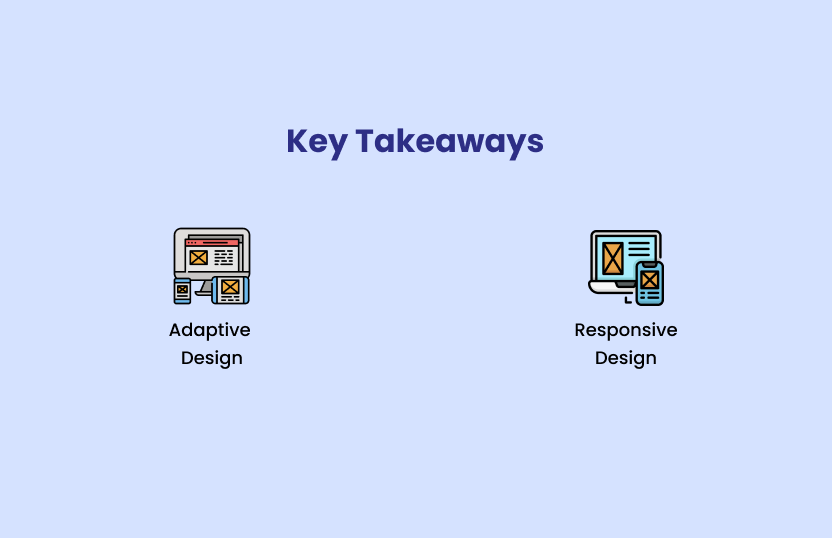
Adaptive Design: Multiple layouts for different devices.
Responsive Design: One flexible layout that adapts to all devices.
Choose the right approach based on your needs and goals.
By understanding the differences between Adaptive and Responsive Design, you can make an informed decision about how to create a website that looks great and works well on all devices.


