Data-Driven Recommendations for E-learning Engagement

The Challenge
Educo’s online learning platform was struggling with low engagement due to an outdated and uninspiring interface. The platform needed a fresh, more user-friendly design that meets user contemporary user expectations.
The Solution
Tentackles conducted a comprehensive design audit, involving a series of assessments, to identify areas for improvement.
Our approach included:
User Research
Gathering feedback from learners to understand their needs and preferences.
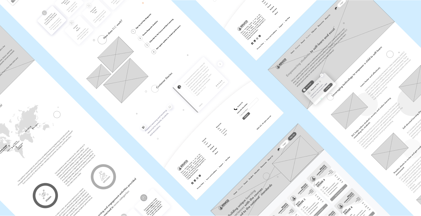
Wireframing
Creating visual representations of the redesigned interface.
Layout Modifications
Implementing changes to improve navigation and usability.
These actionable recommendations were optimized and presented keeping the overall redesign goals in mind.

The Outcome
The redesigned Educo platform featured:
Engaging Interface
A visually appealing and intuitive design that captured learners’ attention.
Improved Usability
Easier navigation and access to course materials.
Enhanced User Experience
A more enjoyable and effective learning environment.
Increased Engagement
Higher user satisfaction and retention rates.