Yesterday I walked into a grocery store on my way home from work. It wasn’t my regular store, but I just needed a few essentials. But what should have been a quick stop turned into a scavenger hunt. No labels or sections—milk in the snack aisle, bread mixed with laundry detergent! I gave it five minutes and eventually left, frustrated and vowing never to return. That’s exactly what it feels like for users navigating a website or app with poor organization.
And that’s why you need to invest your time and efforts in a user-centric information architecture (IA).
IA is your digital product’s floor plan, making sure everything has its place and users find what they need without a scavenger hunt. When it’s user-centric, the structure revolves entirely around what users want, how they think, and how they interact with your site or app.
So, let’s explore what user-centric IA is, why it matters, and how you can organize content effectively. Whether you’re a business owner wanting a website that converts or a designer improving user journeys, keep reading for actionable strategies, common mistakes to avoid, and tools to help you get started.
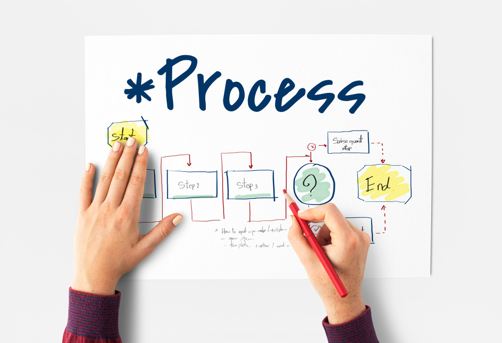
What is User-Centric Information Architecture?

At its heart, information architecture is about organizing, structuring, and labeling content to make it easy to navigate. User-centric IA takes this a step further by prioritizing user needs, goals, and expectations over everything else.
It’s not just about arranging information logically; it’s about arranging it the way users naturally think and search. For example:
An e-commerce site categorizes items by department, like “Clothing” or “Electronics” because that’s how most people shop.
A travel app organizes content into “Flights,” “Hotels,” and “Itineraries,” reflecting common user journeys.
Done right, user-centric IA acts as a GPS for your digital product, guiding users to what they’re looking for.
Why is Information Architecture Important?

Here’s a surprising stat: 37% of users will leave a website if it has poor navigation and content design. And almost 90% of them would head straight to a competitor’s website after the unappealing experience.
Poor IA doesn’t just frustrate—it can cost you conversions and credibility.
Good IA matters because, it:
Makes navigation easier. Users can quickly find what they need. This reduces drop-offs.
Improves engagement. A clear structure encourages users to explore and interact.
Drives results. Whether it’s sales, sign-ups, or clicks, a well-organized IA creates smoother paths to action.
Think of your favorite streaming platform, like Netflix. Its IA allows you to search by genre, browse trending shows, or pick up where you left off—all without thinking twice. That’s IA in action, making an experience enjoyable, not stressful.
Principles of Organizing Content Effectively
Creating great IA isn’t just a guessing game. There are key principles that’ll help find success:
1. Hierarchy
Start broad, then get specific. A tech site, for example, might have categories like “Laptops,” with subcategories like “Gaming Laptops” or “Budget Laptops.”
2. Categorization
Group related items together. For example, a news site might organize stories by “World News,” “Sports,” and “Technology.”
3. Labeling
Keep it simple and clear. A menu item labeled “Find a Doctor” is far better than something vague like “Services.”
4. Consistency
Your structure, labels, and layouts should feel uniform across the platform. Changing how navigation works from one section to another confuses users.
Strategies for Creating User-Centric IA

Designing information architecture that truly works for users isn’t just about arranging content—it’s about understanding the people who will interact with it. A user-centric approach dives deep into user behaviors, preferences, and expectations to build a structure that meets their needs.
Let’s talk about practical steps for building IA that works:
1. Start with User Research
You can’t create user-centric IA without understanding your audience. Conduct interviews, surveys, and usability testing to find out:
What are users trying to accomplish?
What language do they use to describe content?
What frustrates them about current navigation systems?
Example: For a recipe app, research might reveal users prefer searching by ingredients rather than dish names. Your IA can reflect this preference by prioritizing ingredient-based search functionality.
2. Use Card Sorting
This method involves asking users to group content into categories that make sense to them.
Open card sorting: Users create their own categories.
Closed card sorting: Users organize items into pre-set categories.
Here’s an example: For an online bookstore, card sorting might reveal that users prefer to browse by genre (fiction, mystery) rather than format (hardcover, paperback).
3. Build Sitemaps and Wireframes
A sitemap outlines the structure of your content, while wireframes show how each page will look and function. These tools make it easier to spot gaps or redundancies before development begins.
4. Test and Refine
Your first IA draft isn’t the finish line—it’s the starting point. Test it with real users to see what’s working and what isn’t, then adjust as needed.
Common Mistakes to Avoid

Even the best intentions can go wrong. Here are common IA pitfalls:
Overcomplicating Navigation
Too many categories or subcategories overwhelm users. Keep it simple and logical.
Example: A travel website offers options for “Flights,” “Hotels,” and “Car Rentals” on the main menu. But within each section, there are layers of subcategories like “Budget Hotels,” “Luxury Hotels,” or “Family Hotels,” all nested under separate tabs. Users have to dig deep to find what they need, which leads to frustration and high drop-off rates.
How to Avoid It: Keep navigation shallow and straightforward. Group content logically into no more than 2–3 layers deep, and ensure frequently accessed items are easy to spot.
Ignoring Mobile Users
Mobile navigation needs to be concise and touch-friendly. Users have less space and expect navigation to be tailored for touch. A desktop-style menu won’t cut it.
Example: An e-commerce store replicates its desktop navigation menu on mobile, with dozens of drop-down items. Users have to scroll endlessly or pinch and zoom to tap small links. This could increase abandonment rates.
How to Avoid It: Adopt a mobile-first approach when designing IA. Use collapsible menus, prioritize key actions, and ensure touch-friendly spacing for menu items.
Using Confusing Labels
Creative or technical jargon may seem clever, but it often confuses users who are unfamiliar with your product’s terminology. Don’t use jargon or complicated terms that users might not understand. Clarity wins every time.
Example: A fitness app labels its meal-planning section as “Nutritional Blueprints” instead of a more straightforward “Meal Plans.” Users might not immediately understand what “Nutritional Blueprints” means, causing hesitation and missed engagement.
How to Avoid It: Stick to simple, clear, and user-friendly labels. Test your terminology with real users to confirm that it aligns with their expectations.
Skipping User Testing
Assuming your IA works without validating it through testing can lead to blind spots and unexpected issues. Relying on assumptions instead of actual feedback causes costly missteps.
Example: A blog aggregates its content into categories like “News,” “Trends,” and “Insights.” The creators believe these labels are intuitive, but testing reveals that users don’t understand the difference between “Trends” and “Insights,” leading to misclicks and confusion.
How to Avoid It: Conduct usability tests, card sorting, or tree testing to verify your IA works for your target audience. This iterative process helps refine and improve your structure.
Failing to Consider Scalability
IA that works for a small amount of content may crumble as your product grows.
Example: A tech review site starts with 10 product categories, but as more devices are added, the IA becomes cluttered and disorganized. Users struggle to find reviews for newer products, leading to frustration.
How to Avoid It: Plan for growth. Use flexible categories and structures that can expand without overwhelming users or requiring a complete redesign.
By avoiding these mistakes, you can create an information architecture that’s user-friendly, scalable, and designed to deliver a seamless experience across all devices.
Tools to Help You Create User-Centric IA

Here are some popular tools to simplify IA design:
Optimal Workshop: Great for card sorting and tree testing.
Figma and Sketch: Perfect for wireframes and prototypes.
Lucidchart: An easy tool for building sitemaps and flowcharts.
Google Analytics: Provides data on user behavior to inform IA decisions.
Information architecture is the backbone of any great digital product. By focusing on user needs and organizing content thoughtfully, you can create apps and websites that are easier to navigate and more enjoyable to use.
At Tentackles, we specialize in creating user-centric digital experiences, from research and IA design to full-stack development. Ready to make your content work smarter? Let’s chat about how we can help.